|
World-wide average temperatures are rising. But we have always expected pockets and regions where temperatures are either warmer or colder than average. Now, with warming underway, we are seeing where these pockets are forming, and northeastern North America is turning out to be a cooling region. So what’s happening here? Even a small amount of warming soon yields a lot of warming in the Arctic where the bright-white and reflective sea ice melts and exposes the darker, sun-light absorbing water. Though a visit to the high Arctic might still require warm clothing, temperatures have risen dramatically relative to the norm and consequently the temperature difference between the Arctic and mid-latitudes has gotten smaller. We say that the temperature gradient has weakened. And a weaker temperature gradient doesn’t confine the Arctic Jet Stream to a narrow north-south band the way a stronger gradient does. That is, it meanders more, heading farther north and south on its eternally eastward flow. 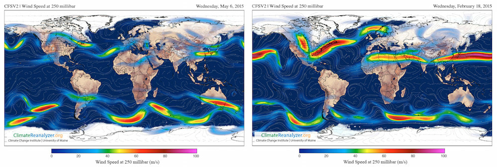 Left: an illustration of the Arctic Jet Stream in its more "zonal", less meandering flow (windspeed at 250 mbar height, May 6, 2015) . Right: an illustration of the now-more-common flow with deeper meanders and stronger north-south wind speeds in the Pacific and over northeastern North America (windspeed at 250 mbar height, Feb 18, 2015). Both plots from Climate Change Institute's Climate Reanalyzer. Over the past two boreal winters, this increased meandering has included a northward meander in the Central Pacific, far enough west to put the western U.S. into severe drought, and a southward meander over northeastern North America bringing cold and snow. 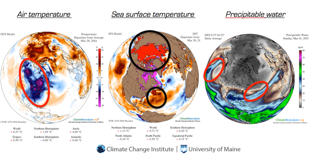 Regional features of climate change observed in the Northern Hemisphere; shown here from conditions on Mar 26, 2014 compared to the average conditions from 1979 to 2000. Air temperatures over most of the Northern Hemisphere are warmer, with Arctic temperatures much warmer, and temperatures over northeaster North America much cooler than the 1979 to 2000 average. Arctic sea surface temperatures are also much warmer than the average as newly exposed sea water absorbs sunlight, and the north eastern Pacific and north western North Atlantic are also significantly warming. Precipitation is occurring farther east in the Pacific, not over the western U.S., and throughout southeastern and eastern North America. From Climate Reanalyzer. As we discovered in the GISP2 ice core, when climate changes abruptly it often begins with abrupt shifts in atmospheric circulation: we are now getting to see such a change in our own time; a result of our own, human-caused rapid climate change. It is scientifically fascinating. So long as one doesn’t think about the human, ecosystem, economic, and security devastation it represents.
by Paul Mayewski The effects of climate change are, and will be, different everywhere. This is not news. But we are now beginning to see how some of the harder-to-predict details are unfolding around the world; the first set of plots below show how air temperature, precipitation, and winds are starting to change around planet. 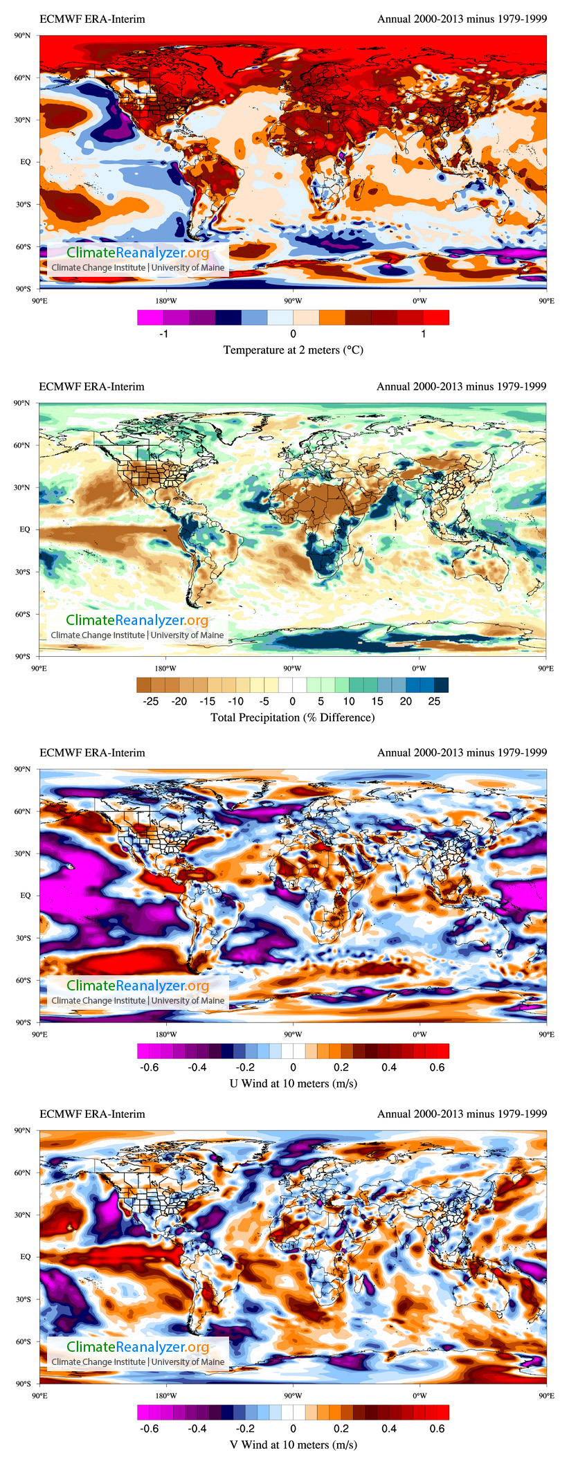 These plots show the changes in temperature (top), precipitation (second), east-west winds (third), and north-south winds (bottom). They were obtained by subtracting the average of these values for 1979 to 1999 from the average for 2000 to 2013. For the wind plots, a positive value means an increase to the east (third plot) or north (bottom plot). Not only are these local changes harder-to-predict, but many are extremely rapid and thus profoundly challenge traditional planning approaches. Detailed predictions are hard enough that modeling often yields more uniform, and gradually changing, predictions as shown in the plots below. What planning strategies can we deploy in the face of such significant uncertainty about what climate we will have where we live and do business? 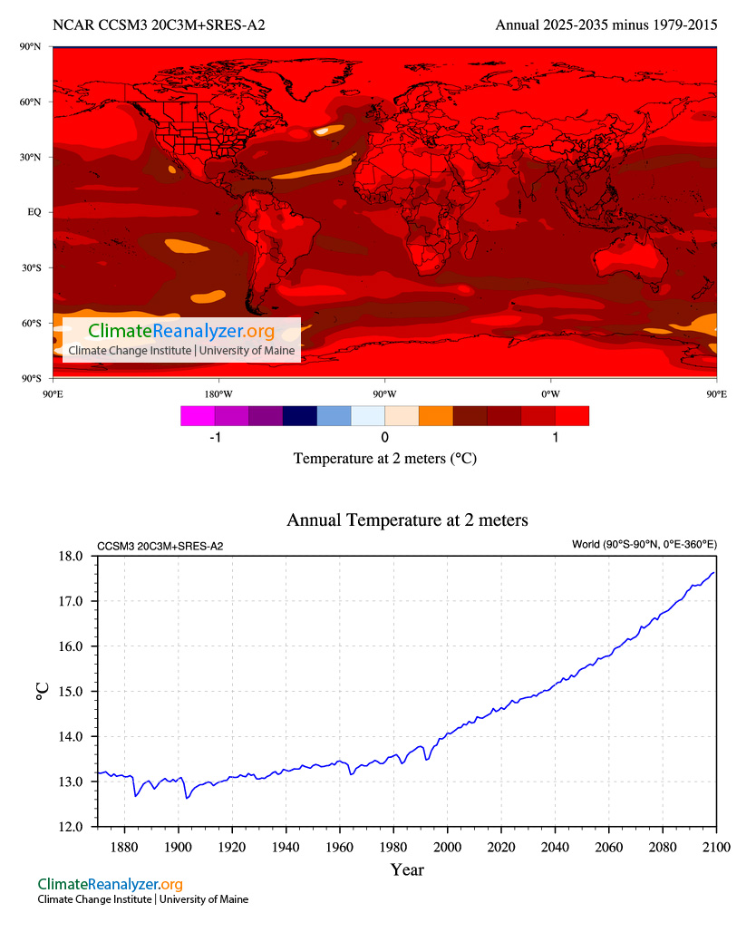 Model predictions for air temperature changes (2025 to 2035 minus 1979 to 2015 averages) around the world in the top plot, and global average temperature in the bottom plot. Temperature changes are not likely to be so uniformly distributed around the world, and the increase in predicted global average temperature is likely more gradual than we have observed in the past. As individuals we respond to uncertainty by imagining several possible outcomes, guessing at their probabilities, and then making choices accordingly: that is, we imagine various scenarios and decide what to do now based on what we think might happen next.
“Scenario” planning is an approach to formalizing, on a larger scale, the intuitive planning we do as individuals on a daily, informal basis. It allows abrupt or uncertain events occurring at different, and uncertain, times to be incorporated into planning: just what is needed for climate change. The U.S. military, and many businesses, began using Scenario Planning after World War II and, in 2013 the National Park Service began applying Scenarios to their climate change planning . The Climate Change Institute has begun work on Scenario Planning tools for a wider range of uses, from local to global and from business to government, with our Climate Futures program. We are excited about this approach and about providing these tools to help policy makers around the world turn scientific discoveries into sound decisions. by Paul Mayewski I recently had the pleasure of appearing in the last episode of the award-winning Years of Living Dangerously series produced by James Cameron, Arnold Schwarzenegger, David Gelber, and others. The host for our section, M. Sanjayan, and a film crew joined our expedition to Tupungatito in the central Andes where we recovered an ice core from close to 20,000 feet. You can see his write up of his experience with us here. We now know that a major result of greenhouse gas warming is changes in large and small scale wind patterns around the globe. The details of exactly when, where, and how much rain falls can have significant implications: Tom Friedman made the case that drought in Syria and surrounding regions played a significant role in the emergence of unrest that led to the Arab Spring. For many farmers around the world, even a small shift that takes rain away from their fields can mean the difference between a good life and becoming a refugee. The purpose of many of our expeditions, including this one, is to discover how increasing greenhouse gases and high-altitude ozone depletion are changing wind and precipitation patterns, allowing better predictions of how water, heat, and pollution are moved around the planet. Our Tupungatito study site, located at the northern edge of the Antarctic Westerlies, provides unique insights into these changes. Shifts in moisture bearing winds are not only leading to drought in the Middle East but also in Africa, Australia, and the western US. The politically unsettled west African country of Mali, home of 14 million people, has experienced significant drought in recent years. The northern two thirds of the country has seen severe drought for decades, while the lower third received enough to grow crops. But, in the last few years, this “wetter” lower third has lost more than half of its usual rainfall, leaving this landlocked country in a critical state. Understanding where, how deep, and how long drought will occur is essential to geopolitical, economic and most importantly humanitarian efforts. 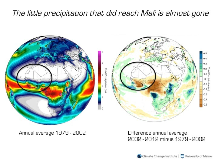 The little precipitation that did reach Mali is almost gone. The map on the left shows average annual precipitation. Mali, circled, receives almost no water in the north and much more in the south. The right map shows the change in precipitation as the 2002 to 2012 average minus the 1979 to 2002 average. The amount of rain now reaching southern Mali is greatly reduced. Plotted using Climate Change Institute Climate Reanalyzer™ software. by Paul Mayewski
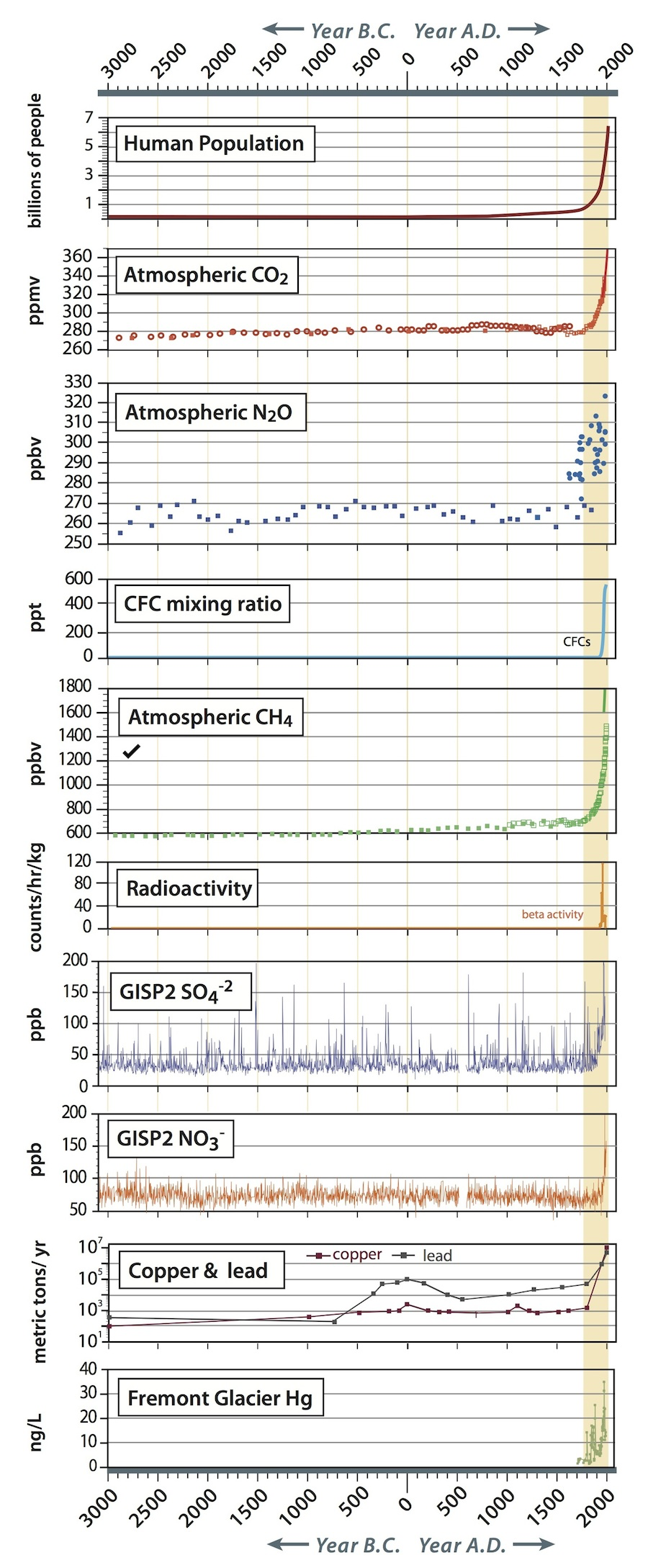
The vast majority of scientists understand the human origins of the rapid, recent rise in greenhouse gases. Even most of the skeptics accept that there has been a rise, debating only the cause and the consequences. But, if recent greenhouse gas rise is not caused by human activity then it is extremely odd that so many other undeniably human components of the atmosphere have also increased dramatically in the industrial era along with greenhouse gases. Ice cores offer robust records of how the atmosphere has changed over thousands and hundreds of thousands of years, and they have given us a detailed view of how it has changed with the advent of human industrialization. The illustration below, taken from the Climate Change Institute’s report on climate change prepared for the State of Maine, highlights the dramatic increases in an amazing range of chemicals over the last century. Though this figure only goes back 5,000 years, the recent, dramatic industrial rise still stands out over the last several million years. Why does any of this matter?
by Michael Morrison
We now know that the general term “climate change” includes many different aspects, from changes in rain and snowfall patterns, to local increases and decreases in temperature, and more. One of the discoveries we have made is that some aspects, like increased carbon dioxide levels, are long-lasting and others, like sulfur emissions, are removed from the air in a matter of a few years. One of the implications of these fast and slow changing pollutants is that the sooner we start on the long-lasting ones, like carbon dioxide, the easier it will be and the greater our success. But another implication is that there are changes we can make that will have an near-immediate effect, and offering a nice, instant-gratification hit in the process. Ground level ozone results when fossil fuel combustion products are exposed to sunlight. Without the combustion products, ozone does not form, and if combustion products are reduced, ozone drops off within days. Ground level ozone is very reactive worsening, and even causing, respiratory illnesses. It also damages plants. Sachin Ghude and colleagues just estimated the crop losses in India resulting from fossil-fuel fueled, ground level ozone. They estimate that 5.6 million tons—5.6 billion kilograms—of wheat and rice were lost from ozone damage in 2005; enough to feed about 94 million people. Just one of the many health, economic, and security costs of climate change, policies that reduce fossil fuel emissions would result in instant, significant, increases in crop yields in India. by Michael Morrison
Joe Romm claimed that the real name for carbon offsets is “carbon rip-offsets” because they are all rip-offs. But the high energy-to-weight and rapid-fueling requirements for aviation fuel means that there are currently no usable substitutes, and there is very little we can do to reduce the carbon emissions of flying other than to not fly. Isn’t there some way we can confidently mitigate our air travel emissions? Ultimately, a true offset will either put carbon back into the ground in a long-lasting form such as coal, oil, or charcoal; or it will reduce the amount of carbon that would otherwise have been dug-up and burned. The first is hard to do, and the second is hard to verify. But M. Sanjayan suggested an approach that makes good sense to me: giving away energy efficient lighting on his trips. The bulbs offset carbon by reducing the energy used to provide light, increasing what I call “energy performance”; providing the same energy services but with less energy. He suggested CFL’s, but LEDs are now in mainstream production and offer an even better solution. I wondered, how many LEDs would I have to buy and give away to offset a given flight? The amount of carbon dioxide produced in the generation of electricity varies around the world, but in the USA the EPA tells us we average about 0.55 kg per kWh. On a visit to my local hardware store this week, I found 60 watt replacement LEDs for $13. These use only 9.5 watts of electricity and produce the same light as a 60 watt incandescent bulb. They are rated to last 25,000 hours. We see that over 25,000 hours, a 60 watt bulb will use 1,500 kWh of electricity and the 9.5 watt LED will use 238; a difference of 1,262 kWh. Using the U.S. average of 0.55 kg per kWh, this means that replacing a 60 watt incandescent bulb with this LED will reduce electric power carbon dioxide emissions by 694 kg. How much carbon dioxide do I emit on a flight? Terrapass, a seller of “offsets”, provides a calculator to estimate this number. They indicate that for a Los Angeles / New York roundtrip, each passenger creates 873 kg of carbon dioxide emissions. It looks like I can offset my carbon emissions from a round-trip cross-country flight by buying and giving away two 9.5 watt, 60 watt replacement, LEDs to someone who will use them to replace incandescents. A significant virtue of this approach is that it is verifiable to me: I know I bought the bulbs; I know I gave them to someone who installed them; and I know they will reduce electric power consumption while providing the recipient with the same energy service (lighting) that they previously enjoyed and saving on electric bills in the bargain. I don’t have to worry about whether the offset company is honest, or how much of my donation is actually going towards an offset, or whether it is really an offset. And, as Sanjayan says, it’s a fun way to make friends at your destination. by Paul Mayewski
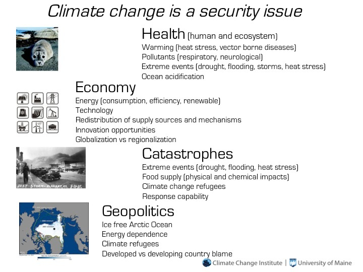
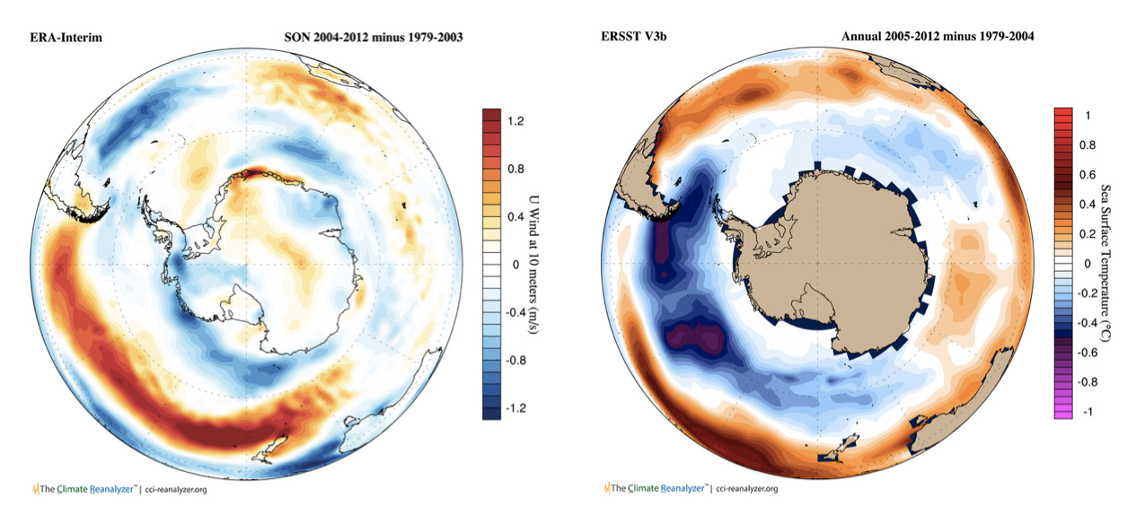
While some may choose to debate the importance of climate change, major businesses and the U.S. military consider greenhouse gas caused climate change a major security issue. The illustration below summarizes the broad range of security issues that can be attributed to rise in greenhouse gases and related pollutants. Share it. by Paul Mayewski CFC-caused, high-altitude ozone destruction occurs in both the Arctic and the Antarctic, but is much more pronounced in the Antarctic. In the Arctic, greenhouse gas warming is the main actor, but in the Antarctic, ozone loss adds a second protagonist, creating a double-whammy. Since ozone absorbs sunlight in the UV-B portion of the spectrum, it warms the atmosphere around it. Thus, with the modern reduced levels of high-altitude ozone in the Antarctic, parts of the stratosphere are much cooler than before. Combined with greenhouse-gas warming to the north, the result is stronger, more-poleward, Antarctic Westerlies—the Antarctic Polar Vortex. These stronger Westerlies, unparalleled for at least the last 5,200 years, combined with greenhouse gas warming, yield a constellation of effects that contrast with those in the Arctic. 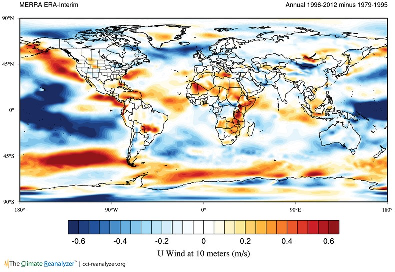 Changes in wind global speeds (U). This plot shows the difference in annual average wind speeds around the globe between the periods 1996 to 2012 and 1979 to 1995. The dark red area just north of most the Antarctic coast, represents a 10% increase in wind speed. Plotted using Climate Change Institute Climate Reanalyzer™ software. The stronger Antarctic Vortex means that the air inside it is colder than it would be if it was weaker. The colder air and stronger winds have resulted in increased amount of sea ice around much of the Antarctic coast line. The higher speeds of the Westerlies also brings more deep water to the surface, that is, more upwelling, which melts the ice shelves from their undersides. So, at the same time that we are observing record lows of Arctic sea ice, we see the record highs of coastal sea ice around Antarctica and record losses of Antarctic coastal ice shelves. 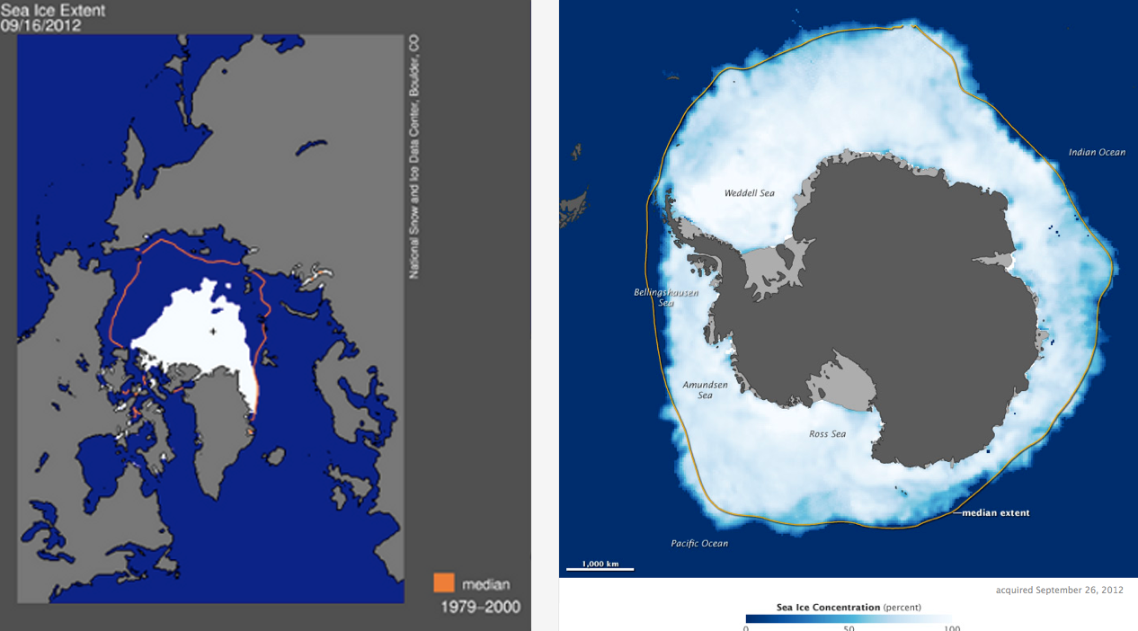 Record low Arctic sea ice and record high Antarctic sea ice. October 11, 2012 “Two weeks after a new satellite era record was set in the Arctic Ocean for the least amount of sea ice coverage the ice surrounding Antarctica reached its annual winter maximum—and set a satellite era record for a new high.” From the NASA Earth Observatory Just to the north of the westerlies, at the northern end of the Antarctic Peninsula, higher than usual temperatures occur due to greenhouse gas warming, just as they do in the Arctic, and record losses of both sea ice and ice shelves are being observed there. See the Antarctic Climate Change and the Environment report for research on Antarctic Westerlies and sea ice. The effects of ozone-loss-caused changes in Antarctic wind patterns also extend to Australia where they are causing droughts in some regions, and to New Zealand and southern South America where they are increasing snowfall on the western slopes and causing some of the glaciers there to advance. While the warmer-than-ice upwelling deep water is melting ice shelves, it is cooler than the greenhouse gas warmed air it meets at the ocean’s surface. Globally, this constant supply of cooler-than-air water at the surface, keeps the air temperatures of the southern hemisphere from increasing as much as those of the northern hemisphere, and keeps global average temperatures from rising as much as they would otherwise. Thus, ozone loss is masking the full effects of greenhouse gas warming just as industrial sulfate pollution did after the 1940s and before the Clean Air Act. 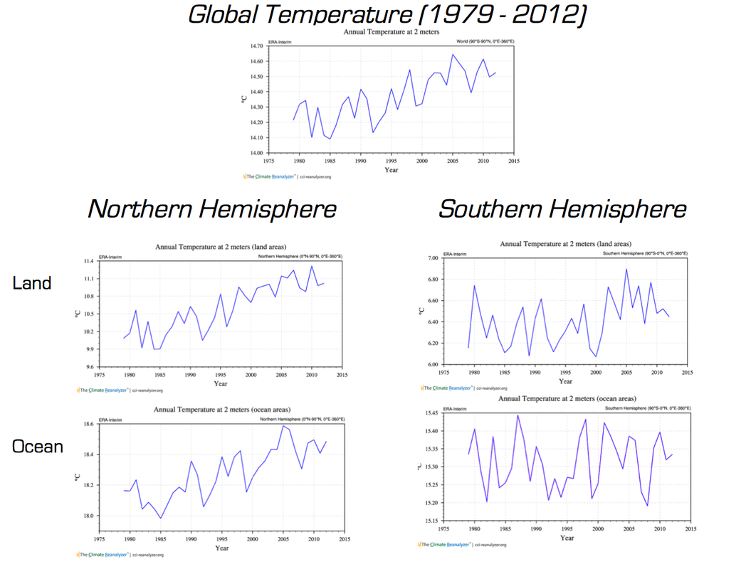 Greenhouse gas warming in the Northern and Southern Hemispheres. The Southern Hemisphere, dominated as it is by oceans, and now also by increased upwelling, does not show as much increase in air temperature as the Northern Hemisphere. The ozone-loss-caused upwelling is masking the global average rise due to greenhouse gases. Plotted using Climate Change Institute Climate Reanalyzer™ software. by Paul Mayewski When we first realized that abrupt climate change was real we thought that these events only happened during ice ages. But then ice cores revealed that the collapse of many civilizations during the last 12,000 years were associated with smaller abrupt-onset changes in the global distribution of precipitation and the amount of sea ice. We wondered if any such events could be seen in the most recent hundred years or so (the “instrumental period”). When we looked, we found at least one: dramatic warming in the Arctic over the past decade, driven by increasing greenhouse gas concentrations. This rapid warming has led to an equally rapid melting of the vast majority of mountain glaciers on the planet, of most of the stabilizing, multi-year Arctic sea ice, and loss of some ice shelves and coastal ice in Antarctica. Because Arctic sea ice acts as a layer of insulation preventing the warmer ocean water from heating the cold Arctic air, and as a mirror preventing the sun from warming the water, its recent loss has led to accelerated warming of the Arctic’s air and water and made the region’s climate one of the fastest changing on the planet. In portions of the Arctic, the rate of change may be the fastest in the last 12,000 years making this event the first of several potential abrupt climate change events triggered by rising greenhouse gas levels. Because the Arctic is warmer than usual, it’s temperature is closer to that of the mid-latitudes resulting in a flattened temperature gradient. This gradient change creates major changes in precipitation patterns, including the current drought in the Western US and a general increase in extremes of temperature and storm strength. 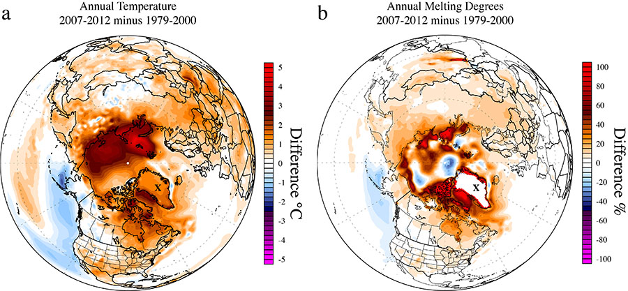 Change in average annual temperature at 2 meters above the ground (left) in °C, and in the percentage of annual melting degrees (right). The annual temperature diagram shows the rapid warming underway in the Arctic, and melting degrees (accumulated degrees above freezing) reveals the longer summers. Both diagrams compare the period 2007 to 2012 versus 1979 to 2000. Calculated from ECMWF ERA-Interim reanalysis monthly 2 meter air temperature data, plotted using Climate Change Institute Climate Reanalyzer™ software. by Paul Mayewski Global wind patterns are the primary means by which water vapor, heat, and pollutants move from place to place around the planet. We now know that the pathways and strength of these patterns can change rapidly, in a few months or years, and then remain in the new pattern for decades to millennia. When this has happened in the past, they have been proverbial “show-stoppers” for civilizations and ecosystems. We didn’t always know this. Back before the 1990s, when we discovered abrupt climate shifts in the GISP2 ice core from central Greenland, we thought the atmosphere was a slave to the ocean, impotently following its direction. The GISP2 discovery of these abrupt shifts radically changed our view of Earth’s climate and our role in it: from a slow-moving hulk taking thousands of years to make meaningful change, to a manic jack-rabbit, that can respond rapidly to changes like the current dramatic rise in greenhouse gases and CFC-caused destruction of high-altitude ozone. GISP2 profoundly changed our thinking—we discovered that large-scale climate changes could happen in less than a political cycle or a human childhood—and that the ocean wasn’t driving these changes: it was the atmosphere. 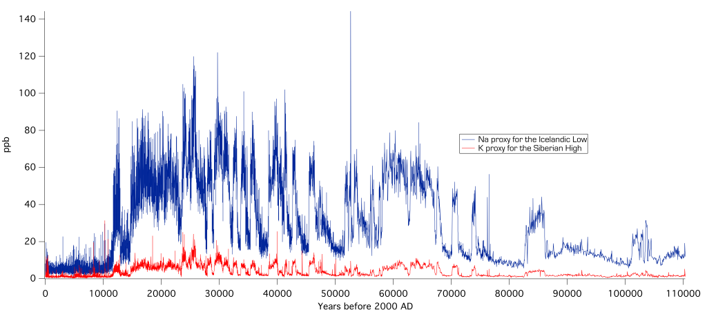 Radical and rapid changes in climate and global wind patterns discovered in the GISP2 ice core. The original GISP2 chemistry data was used to understand the behavior of atmospheric circulation over the past 110,000 years, (see here and here) and revealed abrupt changes in the intensity of major atmospheric circulation patterns. Generally, higher sodium, Na, is associated with deeper Icelandic Lows, and higher potassium, K, is associated with stronger Siberian highs; both part of the modern winter pattern Today, there are distinct summer and winter wind patterns for the Arctic. In the winter, there are pronounced low-pressure systems over the North Pacific and in the North Atlantic over southern Greenland and Iceland (Icelandic Low), and a high-pressure system over Siberia (Siberian High). In the summer, these low pressure systems are much reduced, and the Siberian high is replaced with a low pressure system. The Arctic Westerlies are typically much stronger during the winter pattern. One of the things we discovered in the Greenland ice cores (see here and here) is that the length of these seasonal patterns could suddenly increase or decrease by several weeks to a month or more, with the new pattern persisting for decades to thousands of years. We found that in some cases these transitions could occur in as little as one or two years. 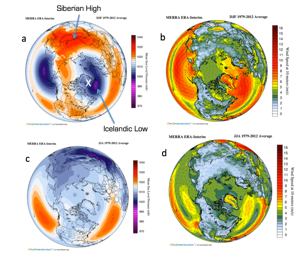 Northern Hemisphere wind patterns during winter (top row, DJF for Dec-Jan-Feb) and summer (bottom row, JJA for Jun-Jul-Aug). The left column shows the winter and summer average surface pressures for the period 1979 to 2012, and the right column shows the associated, average wind patterns. For the pressure diagrams, blue colors show low pressure and orange shows high pressure. For the wind diagrams, red show faster winds, green shows slower, and blue slowest. The white “X” marks the location of the GISP2 ice core. Combined ERA and MERRA climate reanalysis data, plotted using Climate Change Institute Climate Reanalyzer™ software. Many of us are familiar with seasonal changes in weather patterns where we live. The weather patterns at our homes are local reflections of these larger patterns. Just imagine then, if suddenly, let’s say over the last few years, there was a shift toward a longer summer pattern–the transport of moisture, heat, and pollutants would be very different in some regions. An example came during the 2013–2014 winter when drought dominated the US West and cold stormy conditions dominated the US East.
|
 RSS Feed